Daha

Case Study

I led the design for a mobile application aimed at allowing college students to share, trade, and request items in order to make money off of items that they do not use. We assist students facing common challenges on campus, such as quickly needing items that they may have forgotten or lost.

Project Type

Self Start-Up

Role

Lead UI/UX Designer

Project Duration

Active

Overview

Summary

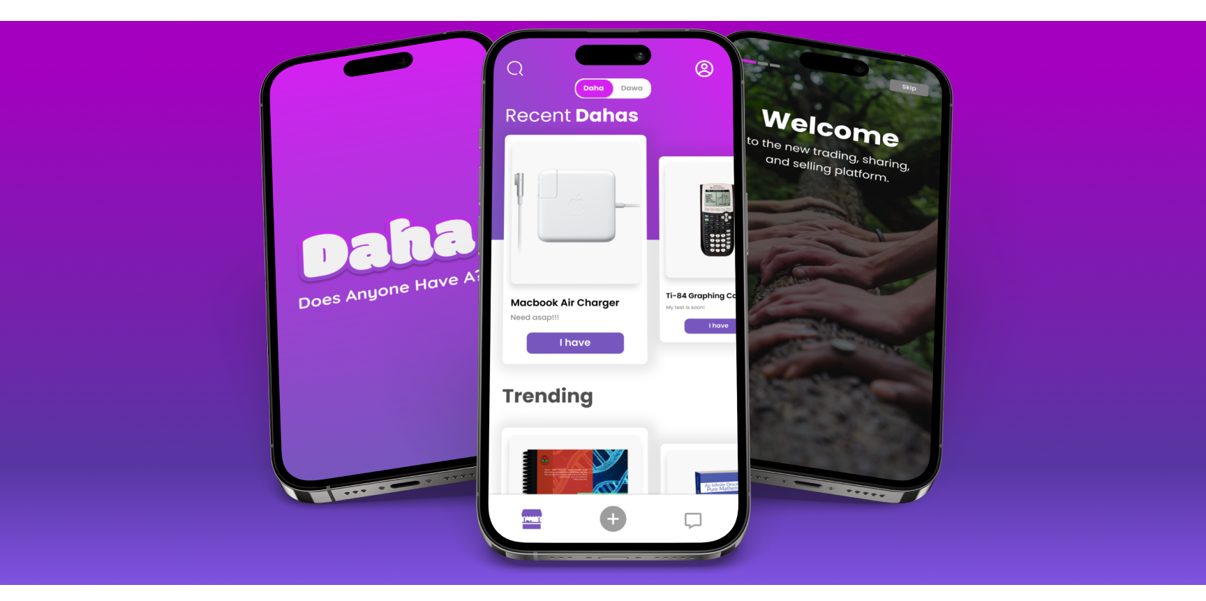
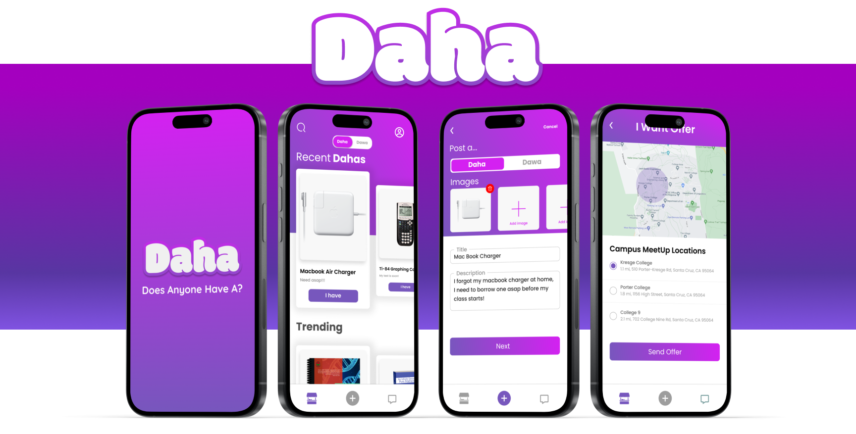
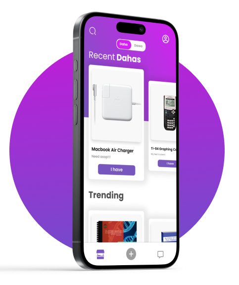
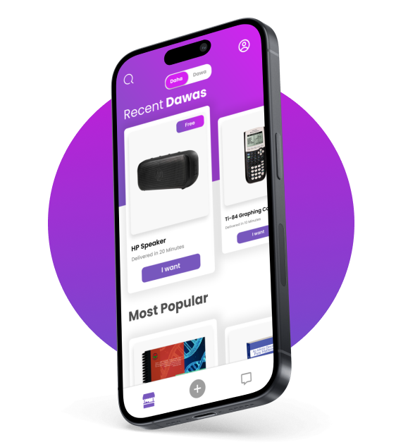
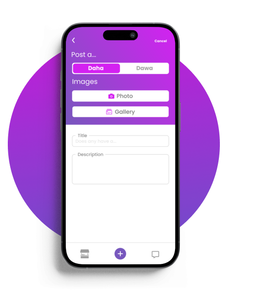
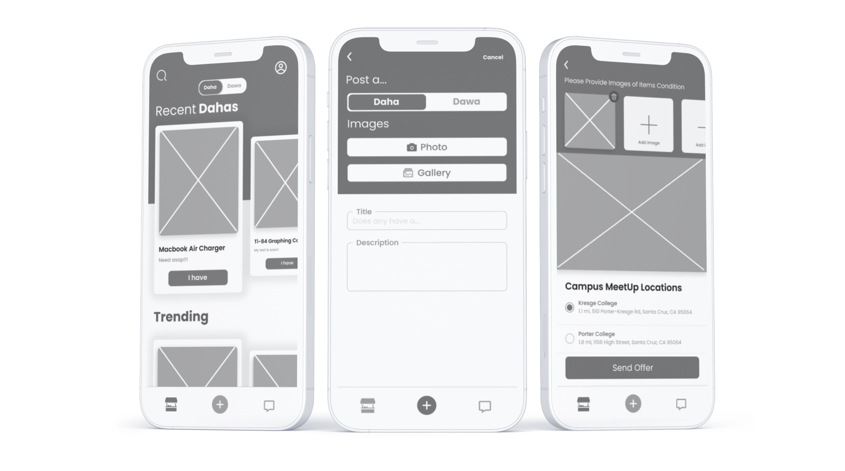
Daha is a student focused mobile application designed to improve the way college and university students share, trade, and request items on campus.Focused on providing a quick and convenient solution to the common challenge of urgently needing essential items, Daha serves as a collaborative platform within a campus community.

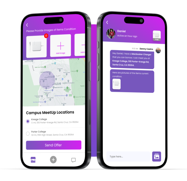
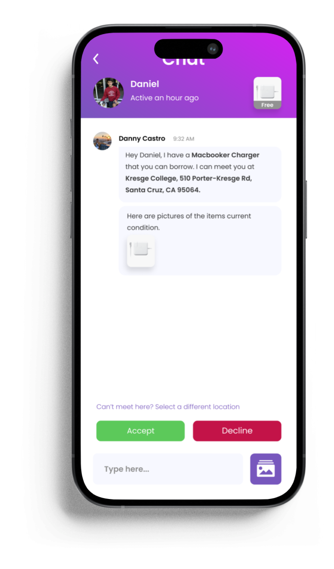
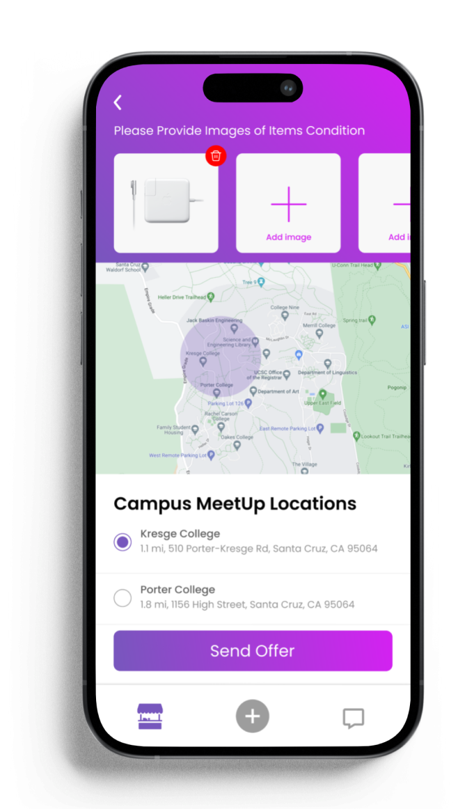
The app's user-friendly interface facilitates seamless item listings, enabling students to effortlessly share, trade, or request items such as chargers, speakers, or textbooks. With location-based matching, Daha connects users within close proximity, ensuring swift and efficient transactions.

Context

Daha emerged from a collective realization among college and university students that the search for essential items when urgently needed on campus was a shared struggle. As a product designer, I observed firsthand the challenges my fellow students faced when urgently requiring items like chargers, headphones, or textbooks.

Through extensive user research, interviews, and surveys, I gained valuable insights into the specific pain points of my peers, fueling the design process. Daha was born not just out of necessity but as a way to seamlessly connect students within the campus ecosystem and enhance their daily lives.

Role & Responsibilities

As a creator and designer of the Daha app, my responsibilities span the entire design process. From conceptualization and user research to wireframing, prototyping, and final user interface design, my focus is on creating an intuitive and visually appealing platform for college and university students. Though, my role extends beyond design to encompass documentation, communication with team members, and branding. Analyzing data and incorporating user feedback, I played a pivotal role in the app's roadmap, ensuring a positive and user-centric experience in the application.

The Problem

College and university students frequently encounter the challenge of urgently needing essential items on campus, ranging from chargers to study materials, leading to stress and inconvenience. The current lack of a dedicated platform increases this issue, forcing students into time-consuming and often inefficient processes of borrowing or searching for items.

The Solution

Daha presents a comprehensive solution to the common challenges faced by college and university students when urgently needing essential items on campus. This mobile application serves as a centralized platform for seamless item sharing, trading, and requesting, directly addressing the inefficiencies of current practices. The user-friendly interface ensures a quick and intuitive experience, allowing students to effortlessly connect with peers within close proximity.

Daha's location-based matching system optimizes the matching process, ensuring timely and efficient transactions. By fostering a sense of community and facilitating quick access to needed items, Daha not only addresses a practical problem but also contributes to an enhanced campus experience. The app's design prioritizes simplicity, usability, and a vibrant visual identity, making it a valuable tool for students seeking swift and convenient solutions to their everyday needs.

How Does It Work?

Daha?

Does Anybody Have A? As a user, ask for items that you urgently need. From a macbook charger that you need for class, or a calculator that you forgot before your midterm, we have your book.

Dawa?

Does Anybody Want A? As a user, make money by listing up the items that you have lying around. Have a speaker that you don’t need? Want to sell a textbook from last quarters class?

Post a Daha or Dawa

Freely post a Daha or Dawa. The application allows you to post images of the items for other users to view. You can also add a title and description to describe the condition of the item or what you need.

Safely Receive Your Item

The app automatically gives public and safe locations for meet ups. Communicate with the other person to better organize the transaction.

Designing The App

Researching My Target Audience

I conducted in-depth interviews as a foundational element of user research. By engaging directly with college students, I sought to understand their daily lives on campus and the specific instances when they urgently required items.

  • One-on-One interviews: I explored a variety of topics to create a comprehensive profile of the typical college student's lifestyle. I delved into their academic routines, social interactions, and the moments when they felt the immediate need for items such as chargers, textbooks, or other essentials. By encouraging participants to share personal anecdotes and experiences, I was able to uncover not only the practical challenges but also the emotional aspects of these situations.

The interviews provided valuable qualitative data, allowing me to create detailed user personas that represented different segments of the college student population. The insights gained from these conversations formed the basis for a user-centered approach, ensuring that the Daha app would genuinely address the real-world challenges faced by college students in their day-to-day lives.

From Low-fidelity To Mid-fidelity Designs

Moving from low-fidelity to mid-fidelity designs in the design process is pivotal for iterative refinement and user-centered development. Mid-fidelity designs provide a more detailed representation, enabling designers to incorporate valuable user feedback, conduct usability testing, and align the visual aspects with branding elements. This phase serves as a bridge between conceptualization and implementation, fostering effective communication with stakeholders and ensuring a clear, informed, and flexible design direction.

Low Fidelity Wireframing

The importance of Low-fidelity

This phase began with sketching out basic wireframes and layouts on paper, swiftly translating ideas into basic representations. These early sketches served as a canvas for exploring elements such as item listings, user profiles, and interaction patterns.

As I progressed, I created low-fidelity digital wireframes using my iPads sketch tool, maintaining a focus on simplicity and core functionality. These wireframes allowed for quick iteration, enabling me to test various layouts and user flows efficiently. By presenting these skeletal designs to potential users and stakeholders, I gathered invaluable insights into the clarity and intuitiveness of the app's fundamental features.

Testing Low-fidelity

These low-fidelity representations allowed for rapid testing and iteration of key user interactions and flows without the distraction of intricate details. By presenting these low-fidelity designs to potential users and stakeholders, I was able to gauge their reactions and gather valuable feedback on the overall concept and functionality.

This testing phase helped uncover potential usability issues, refine navigation pathways, and validate or adjust fundamental design decisions. The simplicity of low-fidelity designs made it easier to focus on the core user experience, ensuring that the fundamental concepts resonated well with the intended audience.

Mid Fidelity Wireframing

Creating Mid-fidelity

Creating mid-fidelity designs was crucial in the design process for several reasons. Mid-fidelity designs offered a more detailed and realistic representation of the user interface compared to low-fidelity sketches, allowing for comprehensive user feedback and usability testing. The increased level of detail facilitated effective communication with potential users, aligning the design vision with project goals.

Furthermore, it served as a strategic phase for exploring visual elements, refining the user experience, and addressing potential issues before the final implementation. The transition to mid-fidelity designs struck a balance between iterative refinement and resource efficiency, ensuring that the design direction was informed, user-centric, and well-prepared for the subsequent stages of development.

How Did Low & Mid-fidelity Features Contribute to Features?

The low and mid-fidelity stages played a pivotal role in shaping and refining the crucial Locations and Review features within the Daha app. During the low-fidelity phase, initial concepts for these features were rapidly sketched and explored on paper and in digital wireframes. This allowed for quick ideation and iteration, focusing on the fundamental structure and interactions of both features. The simplicity of low-fidelity design facilitated a conceptual understanding of how the app would address user safety and trust.

Safety Comes First

Public Locations

The Locations feature in Daha is a strategic addition aimed at enhancing user safety and convenience. Recognizing the importance of secure meet-ups, this feature dynamically displays on a map the recommended locations for users to trade items. By leveraging mapping technology, users can identify well-traveled and designated meet-up spots on their campus or within the vicinity, fostering a sense of security during exchanges. This not only streamlines the logistics of item trades but also promotes a safer trading environment, reducing uncertainties associated with unfamiliar locations.

Trader Reviews

The review feature is a key element designed to foster trust and accountability within the Daha community. Users are encouraged to build comprehensive profiles that provide insights into their trading history and reliability. However, the innovative aspect lies in the dynamic review system. After each trade, users have the opportunity to leave honest and transparent reviews about their trading partners. These reviews serve as a valuable resource for others, offering a firsthand account of the seller or buyer's behavior, reliability, and overall satisfaction with the transaction.

UI Tool Kit

Logo

App Colors

Typography

The Future of Daha

As Daha evolves beyond the MVP stage, several key enhancements are on the horizon. The introduction of advanced user profiles aims to instill greater trust within the community through features such as user ratings and trading history. Simultaneously, an integrated in-app call feature will streamline user communication during trades, enhancing the overall user experience.

Prioritizing user safety, Daha plans to implement geofencing technology to designate secure trading locations on campuses. Additionally, the platform aims to diversify traded items, moving beyond electronics to include textbooks, clothing, and essentials, catering to a broader range of user needs.

Social features and community-building initiatives are set to strengthen user connections. To fortify security measures, Daha will introduce features like two-factor authentication and secure payment options, ensuring user confidence in transactions.

Looking forward, AI-driven recommendations will enhance item discovery based on user preferences, transaction history, and campus trends. Collaboration with local businesses for exclusive deals and discounts aims to add value to the user community while fostering beneficial partnerships. We also aim to push our app to our current schools such as UCLA, Stanford, and UCSC.

Lastly, accessibility improvements underscore Daha's commitment to inclusivity, ensuring the app is user-friendly for individuals with diverse needs. These strategic enhancements collectively propel Daha toward creating a more dynamic, secure, and inclusive platform for campus item exchanges.